Why we rebranded Supraide — and why most rebrands fail?
# Why we rebranded Supraide — and why most rebrands fail
Last quarter we rebranded our own studio. New logo. New typography. New tone of voice. New website rebuilt from the ground up.
We’d been operating with the previous brand for two years. It worked. Clients didn’t complain. Our deliverables looked fine.
So why change?
Because “fine” is the most expensive position a studio can hold. Fine doesn’t get referred. Fine doesn’t get screenshotted. Fine doesn’t get remembered by the founder who needs help six months from now.
This post is the framework we used to rebrand ourselves — and the three traps we deliberately designed against. If you’re considering a rebrand for your firm or your own business, read this before you spend a dollar.
## The trap most rebrands fall into
Most rebrands start with the wrong question.
The wrong question is: **”What should our new brand look like?”**
The right question is: **”What is our brand failing to communicate that’s costing us business?”**
When you start with “look like,” you end up with a moodboard exercise. Pretty fonts, color palettes, a polished logo — and zero impact on revenue six months later.
When you start with “failing to communicate,” you uncover specific gaps. Maybe your brand doesn’t communicate technical depth, so you’re losing engineering-heavy clients to competitors. Maybe it doesn’t communicate scale, so enterprise prospects assume you’re too small. Maybe it doesn’t communicate craft, so you’re competing on price.
Each of those gaps requires a different rebrand. They’re not aesthetic decisions — they’re strategic ones.
## How we diagnosed our own gap
We asked our last twelve clients one question: “Before you hired us, what almost made you go with someone else?”
The answers clustered around one theme. Nobody questioned the work. Nobody questioned the price. They questioned whether we were *serious enough*. Whether a small bilingual studio operating between Virginia and Nicaragua could actually ship at the standard they needed.
Our previous brand wasn’t communicating engineered seriousness. It was communicating “creative agency” — which is a category we don’t want to be in.
That diagnosis defined every choice that followed.
## The three traps we designed against
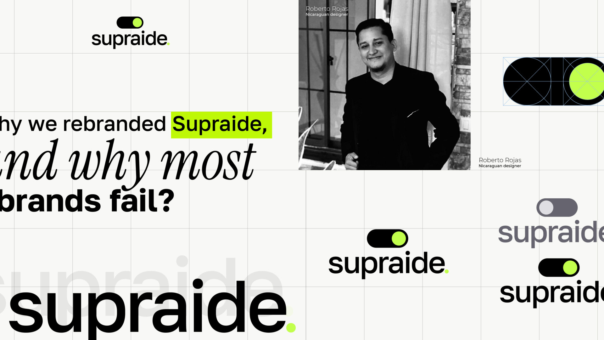
### Trap 1 — Over-designing the logo
Most rebrands obsess over the logo. They commission custom letterforms, hire illustrators, run dozens of concepts.
The logo is the least important part of a brand system.
Think about it: when’s the last time you chose a vendor because of their logo? You chose them because of how their site felt to navigate, how their proposal read, how their first email landed in your inbox.
We gave the logo about 5% of our rebrand budget. We spent the rest on the system around it: typography that holds up at every size, a color palette that works in dark mode and on print, a tone of voice document that explains how we write Slack messages versus how we write proposals.
The logo we ended up with is a switch. Two shapes — a capsule and a knob. It took an afternoon. It’s perfect because it does its job: it’s a memorable mark that scales from favicon to billboard. That’s the entire spec for a logo.
### Trap 2 — Branding for the agency, not the client
You see this constantly. An agency rebrands itself with the trendy aesthetic of the year — gradient blobs in 2021, brutalist serifs in 2023, monochrome glassmorphism right now — and the rebrand says nothing about what they actually deliver.
The brand was for the agency, not for the client.
When we redesigned ours, every choice had to answer one question: **does this make it easier for our ideal client to trust us with $50K?**
Mono-spaced UI labels (`/// SYSTEM.STATUS`) — yes, because they communicate engineering rigor.
A switch as our mark — yes, because it’s the literal metaphor for what we do (turning systems on for clients).
Italic serif accents on key headlines — yes, because they signal editorial quality, which signals we care about details.
Every choice tracks back to “does this build trust.” If a choice was just aesthetic, we cut it.
### Trap 3 — Treating the rebrand as a launch, not a system
Most rebrands launch with a big reveal. New site, new logo, an animated video, a thread on Twitter. Then six weeks later, the team is already off-brand because nobody documented how to use the new system.
The rebrand was a moment, not a tool.
We documented everything. Brand guidelines as a 40-page PDF. Component library in code. A decision log explaining *why* every choice exists, so future hires don’t accidentally undo intentional decisions.
When a client asks us to rebrand them, the deliverable is never “the rebrand.” It’s “the system that makes your rebrand maintainable for the next five years.” That’s the difference.
## What changed after the rebrand
Three concrete outcomes, all measurable:
**Inbound qualification improved.** Before the rebrand, we’d get inquiries that started with “how much do you charge?” After the rebrand, inquiries start with “we have $X budget — can you help with Y?” The brand is pre-qualifying.
**Proposal close rates went up roughly 25%.** Same proposals, same pricing — but the brand around them communicated more authority, so prospects accepted faster.
**Referrals got more specific.** Clients started referring us with phrases like “they’re the engineering studio for marketing” — language we’d put in our positioning. The brand had given them words to describe us.
## What this means for your firm
If you’re considering a rebrand, three questions before you start:
1. **What is your current brand failing to communicate that’s costing you specific business?** Not “it looks dated” — that’s not a reason. The reason is “we’re losing enterprise clients because we look small.”
2. **Who is the rebrand for?** If it’s for your team’s pride, save the money. If it’s for a specific client persona you’re trying to win, proceed.
3. **What’s the system, not just the visuals?** A logo and a website are not a rebrand. The system — typography rules, voice guidelines, decision documentation — is what makes the rebrand stick.
When you can answer those three questions clearly, you’re ready. Until then, you’re just buying a moodboard.
—
If you want our help thinking through this for your firm — we offer rebranding diagnostics as a paid two-week engagement. Email hello@supraide.com to scope it.